First impressions are made in the blink of an eye. On the web, it’s even faster. Users form an opinion about your website in just 50 milliseconds—and 94% of that first impression is based on design.
If a visitor lands on your site and it feels like a time warp—with clashing colors, tiny text, and a layout from a bygone era—they immediately question your professionalism and credibility. As a website strategist, I see it constantly: businesses with excellent services undermined by a “digital dust bunny” of a website.
But this goes deeper than just aesthetics. An outdated design is almost always a sign of a poor user experience (UX), a frustrating digital maze that actively drives customers away. This isn’t just a minor issue; it’s a silent business killer.
The Twin Killers: Outdated Design & Poor User Experience
It’s crucial to understand the two forces working against you:
- Outdated Design (The Trust Killer): This is the look and feel. Think old-fashioned layouts, inconsistent branding, or unprofessional stock photos. A visually dated site erodes trust because users associate modern design with quality and credibility.
- Poor UX (The Conversion Killer): This is how the site works—or doesn’t. It’s the confusing menus, the cluttered pages, the broken links, and the lack of a clear path for the user to follow. A bad UX doesn’t just look bad; it feels frustrating and makes it impossible for visitors to achieve their goals.
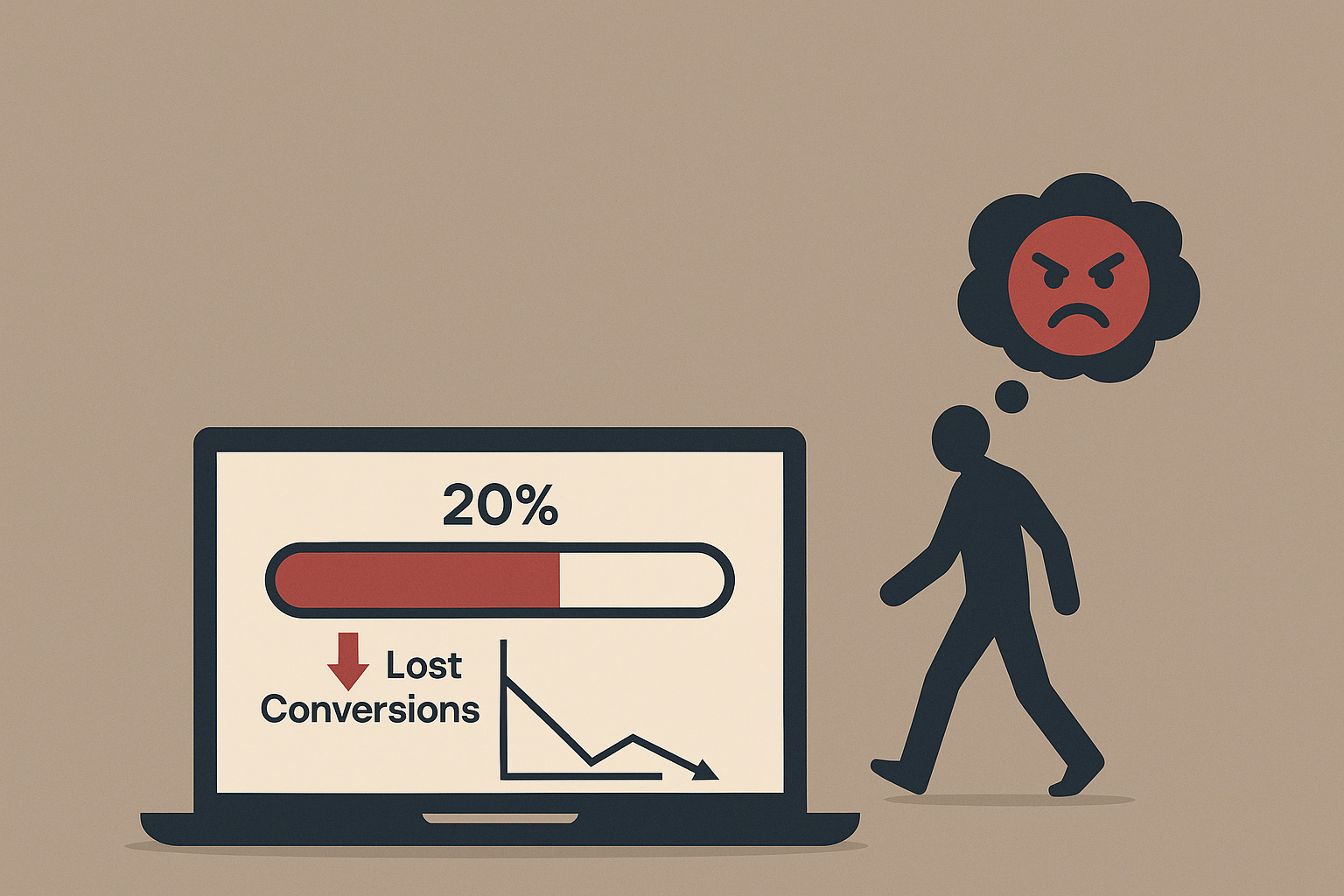
The result? 88% of online consumers won’t return to a website after having a bad experience. They don’t send you an email to complain; they just leave and give their money to your competitor.
Bad UX Disasters: Real-World Examples from Big Brands
Even major companies get UX wrong, providing powerful lessons.
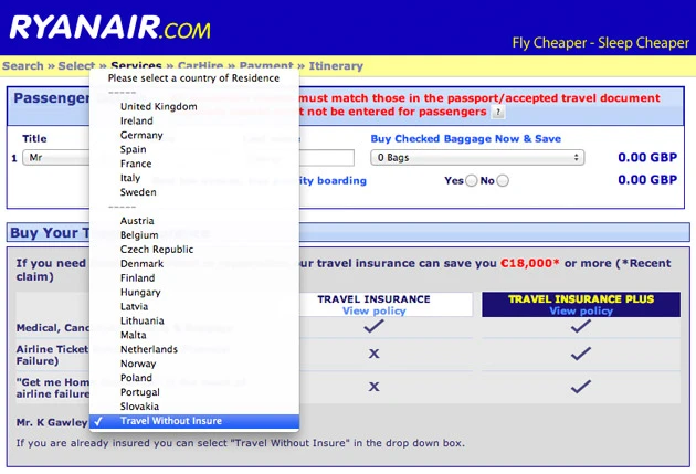
- Ryanair’s Deceptive Design: The airline was notorious for using “dark patterns” in its booking system. To avoid travel insurance, users had to find the hidden “do not need insurance” option inside a country dropdown list—a deliberately confusing design meant to trick users into paying for an add-on they didn’t want.
- Amazon’s Information Overload: Some of Amazon’s product pages can be overwhelming, with thousands of reviews and cluttered layouts. Studies show this can lead to “analysis paralysis,” where too much information actually reduces sales because shoppers get confused.
- Netflix’s Autoplay Feature: For years, Netflix’s feature of automatically playing trailers and the next episode was a source of major user frustration. It often started without user consent, creating a disorienting experience, especially for users with accessibility needs.
These examples prove that no business is immune. When business goals are prioritized over a smooth user journey, trust is broken and users are driven away.
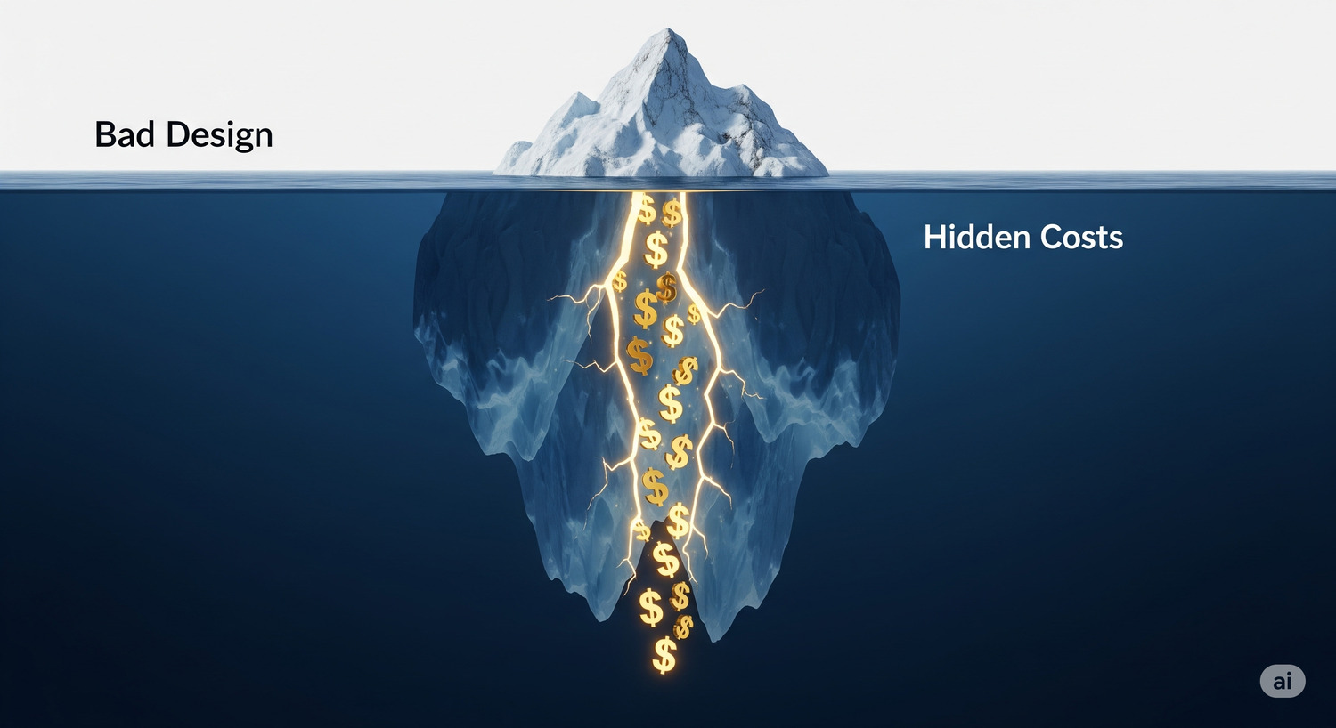
The Hidden Costs: How a Bad Website Bleeds Your Business Dry
A poorly designed website is more than just an inconvenience; it’s a financial drain.
- Directly Kills Conversions: Businesses lose an estimated 35% of sales due to bad UX. Every confusing step in your checkout process, every hard-to-find contact form, is a lost sale.
- Destroys Brand Reputation: With 75% of users judging your credibility on design alone, an outdated site makes you look unprofessional. 44% of users will tell their friends about a bad online experience, creating negative word-of-mouth.
- Wastes Marketing Dollars: Pouring money into ads that lead to a frustrating website is like trying to fill a leaky bucket. You pay to attract visitors, only for them to be driven away by poor design.
- Harms Your SEO: Search engines like Google prioritize sites that offer a great user experience. High bounce rates and short visit times are signals of bad UX, which can lead to lower search rankings and less organic traffic.
The Fix: A Blueprint for a Modern, User-Centric Website
Transforming an outdated website is not about blindly following trends; it’s about adopting a user-centric philosophy. Here is your actionable plan.
- Start with In-Depth User Research: Don’t assume you know what your users want. Conduct interviews, send surveys, and perform usability tests to understand their needs and pain points. Data-driven design is always more effective than guessing. Just five users can be enough to find 85% of your site’s usability issues.
- Simplify Everything: A cluttered interface is a conversion killer. Embrace minimalism and whitespace to reduce cognitive load. Every element on your page should serve a clear purpose. If it doesn’t help the user, remove it.
- Create Clear, Intuitive Navigation: Users should never have to think about where to go next. Use clear, simple labels for your menus, ensure your logo links back to the homepage (36% of visitors expect this), and provide a logical path toward conversion.
- Prioritize Technical Excellence: A modern UX depends on a solid technical foundation.
- Mobile-First & Responsive Design: Your site must provide a seamless experience on all devices, from desktops to smartphones.
- Fast Load Times: A 1-second delay can reduce conversions by 7%. Optimize images, use good hosting, and minimize bloated code to ensure your site is lightning-fast.
- Build Trust and Ensure Accessibility:
- Add Trust Signals: Use testimonials, reviews, security badges, and a clear “About Us” page to build credibility.
- Focus on Accessibility: 71% of users with disabilities will leave a site that is difficult to use. Ensure proper color contrast, provide alt text for images, and make sure your site is navigable via a keyboard.
Investing in UX is one of the smartest business decisions you can make. For every $1 invested in UX, the average return is $100—a staggering 9,900% ROI. Don’t let your website be a digital relic. By focusing on your user, you can transform it into your most powerful tool for growth.