Your website is speaking to you.
It is speaking every second of every day. It is telling you exactly where your customers are confused. It is telling you why they are leaving. It is screaming precisely what you need to fix to double your sales.
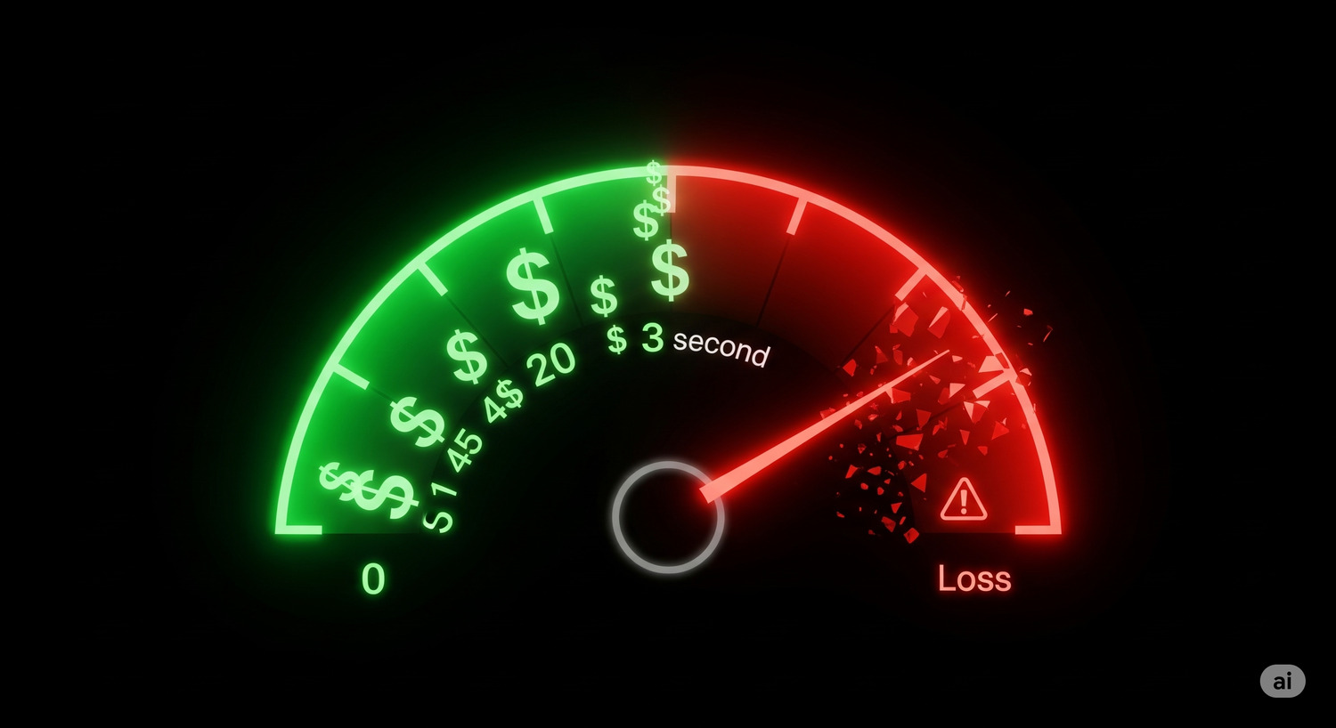
But it is speaking in a language you probably don’t speak: Data.
For most business owners, “web analytics” is a source of anxiety, not insight. You log into Google Analytics, and you are immediately assaulted by a wall of graphs, charts, and acronyms. Bounce rates, session durations, acquisition channels.
It feels overwhelming. So, you look at the total traffic number, maybe check the sales figure, and then you close the tab. You go back to guessing.
This is dangerous. If you aren’t listening to the data, you are flying blind. You are trying to fix a leaky bucket in the dark.
The good news is that you don’t need to be a data scientist to find the leaks. You just need to be a detective.
Here is the simple, 3-step process for using website optimization data to move from confusion to clarity.
Data Is Not a Spreadsheet. It’s a Story.
To fix your website, you need to change how you view data. It is not a report card; it is a crime scene investigation.
Imagine you are a detective trying to solve the mystery of the “Missing Customer.” You have two types of tools in your kit, two settings on your flashlight:
- Quantitative Data (The Wide Beam): This tells you what happened and where it happened. It reveals the footprint outside the window.
- Qualitative Data (The Focused Beam): This tells you why it happened. It is the security camera footage that shows you exactly what the suspect did.
You need both. Numbers without behavior are just trivia. Behavior without numbers is just an anecdote. Together, they are the answer.
Step 1: Find the Footprint (The “What” and “Where”)
Your first job is to locate the leak. You do this with Quantitative Data.
You don’t need to look at every metric. You only need to look at the Purchase Journey.
Every customer must walk a specific path to buy from you. It usually looks like this:
- Session Start (Land on site)
- View Product
- Add to Cart
- Purchase
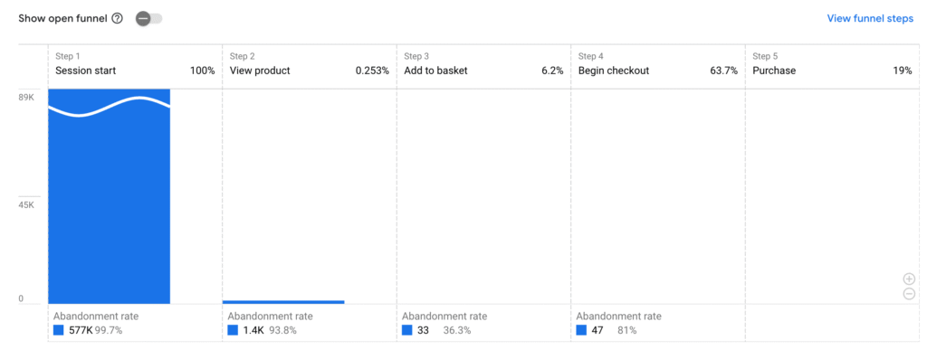
Open your analytics tool (like Google Analytics) and look at the drop-off between these steps. This is your Google Analytics funnel.
Let’s look at a hypothetical scenario:
- 1,000 people start a session.
- 300 people view a product. (A 70% drop-off).
- 150 add a product to the cart. (A 50% drop-off).
- 75 complete the purchase. (A 50% drop-off).
Do you see it?
You might be obsessing over your checkout page, but your data is screaming that your biggest problem is on your homepage. 70% of your visitors are leaving without ever even looking at a product.
That is your “Metric on Fire.” That is the footprint.
But here is the limit of quantitative data: It tells you that people are leaving, but it doesn’t tell you why. Are they confused? Is the button broken? Is the load speed slow?
To find out, you have to switch tools.
Step 2: Watch the Security Footage (The “Why”)
Now that you know where the crime is happening (the homepage), you need to see it through your victim’s (the user’s) eyes.
You do this with Qualitative Data. Specifically, you use two powerful tools: Heatmaps and Session Recordings.
Heatmaps: The Thermal Camera
A heatmap takes thousands of user interactions and aggregates them into a visual map.
- Red/Hot areas are where everyone is clicking and looking.
- Blue/Cold areas are being ignored.
I once audited a site where the “Contact Us” button was cold blue. Nobody was clicking it. Why? The heatmap showed a bright red hot-spot on a picture of a telephone icon that wasn’t a link.
Users were clicking the picture, nothing was happening, and they were leaving in frustration. The numbers (drop-off rate) showed the leak; the heatmap showed the cause.
Session Recordings: The Security Tape
This is the most powerful tool in your arsenal. Tools like Microsoft Clarity or Hotjar allow you to watch anonymized videos of real users navigating your site.
It generates empathy instantly.
In my book, I tell the story of a product page that was bleeding sales. The numbers looked fine, but the conversion was low.
I watched the recordings. I saw users scrolling down to select a color (“Blue”). Then, they would frantically scroll all the way back up to see if the product image changed. Then scroll back down to pick “Red.” Then scroll back up.
Back and forth. Up and down.
You could feel their frustration. The color selector was too far away from the image. It was a design flaw that no spreadsheet would ever capture. But on video, it was obvious.
Step 3: Form Your Hypothesis (From Clues to Action)
You have the footprint (the data). You have the footage (the recording). Now, you need to make an arrest.
You need to turn your insight into an action plan. In the C.O.N.V.E.R.T. Method, we call this forming a Hypothesis.
Do not just say, “Let’s change the design.” Be specific. Use this structure:
“Based on [qualitative insight], we believe that [specific change] will result in [measurable improvement], because [reason].”
Using the example above:
“Based on session recordings showing users scrolling frantically between the color options and the image, we believe that moving the color selector directly below the main image will result in higher add-to-cart rates, because it will reduce friction and make the decision easier.”
This is no longer a guess. It is an educated, evidence-backed theory.
Now, you are ready to test it.
Your Data Detective Toolkit
You don’t need expensive software to do this. You can start today for free.
- Quantitative: Google Analytics. It is the industry standard for finding the “what.” Use the “Funnel Exploration” report.
- Qualitative: Microsoft Clarity. It is free, easy to install, and provides both heatmaps and session recordings.
From Reactive to Proactive
Most businesses only look at data when sales tank. That is reactive.
The goal of Refinement is to be proactive. It is to build a habit of continuous improvement.
If you find one leak that fixes 10% of your sales, and next month you find another that fixes 5%, and the month after you find another… you are building a compound growth engine.
You are no longer hoping for success. You are engineering it.
Conclusion
Stop being intimidated by data. Data is just your customers trying to talk to you.
They are telling you where they are stuck. They are showing you where they are frustrated. They are begging you to fix the bucket so they can give you their money.
All you have to do is listen.
Your Next Step: You have formed a brilliant hypothesis based on data. But what if you’re wrong? There is only one way to know for sure. You have to put your idea on trial. Learn how to run the final reality check in the C.O.N.V.E.R.T. Method: A/B Testing (covered in Chapter 8 of the book).
This article covers the Refinement principle. For the complete diagnostic framework, including pre-built Google Analytics funnel templates, a heatmap interpretation guide, and the “Hypothesis Worksheet,” get your copy of Decoding The Click.