Your website’s homepage is your digital front door. It’s the first impression, the welcoming handshake, and the immediate answer to a visitor’s most pressing question: “Am I in the right place?”
You have just 50 milliseconds (0.05 seconds) to provide a good answer. That’s how fast users form a subconscious opinion, and 94% of that first impression is based on design.
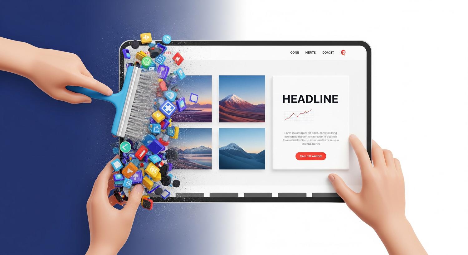
If your homepage is a cluttered, confusing mess, it doesn’t just look unprofessional; it actively drives potential customers away. As a website strategist focused on turning digital properties into profit centers, I can tell you that a poorly designed homepage is one of the most significant—and most common—barriers to growth.
This is your definitive guide to decluttering the mess and building a homepage that captivates, guides, and converts.
The High Cost of a Cluttered Homepage
A messy homepage isn’t just an aesthetic problem; it’s a financial one. When visitors are overwhelmed with too many competing elements—text, banners, pop-ups, and images—it creates a high “cognitive load”. Instead of feeling guided, they feel confused and frustrated.
The data on this is unforgiving:
- Conversions Plummet: Research from Google/SOASTA found that as the number of elements on a page increases from 400 to 6,000, the probability of conversion drops by 95%.
- Trust Disappears: A chaotic design erodes credibility. In fact, 46% of visitors won’t trust a company if its mission and value proposition are unclear.
- Visitors Leave Instantly: A cluttered page leads to high bounce rates. With 88% of online consumers less likely to return after a bad experience, you don’t get a second chance.
- Marketing Budgets Are Wasted: Driving paid traffic to a confusing homepage is one of the fastest ways to burn through your marketing budget with nothing to show for it.
The Blueprint for a High-Converting Homepage
While your homepage may not always be a visitor’s first entry point, there’s a high chance they will land there eventually. Research shows 36% of visitors will click your logo to navigate to the homepage to orient themselves. Your homepage must act as a clear and helpful hub.
To achieve this, focus on including these critical elements, strategically placed for maximum impact.
1. A Clear & Compelling Value Proposition (Above the Fold) This is your “elevator pitch.” It should be the first thing a visitor reads and should immediately answer “What do you do?” and “What’s in it for me?”.
- Actionable Tip: Craft a powerful, benefit-oriented headline and a concise sub-headline that explains your offering in simple terms. Place it high on the page alongside your hero image.
2. Intuitive and Simple Navigation If visitors can’t find what they’re looking for, they’ll leave. Your navigation should be a clear, logical map of your site’s most important pages.
- Actionable Tip: Keep your main menu lean, with 5-7 top-level items at most. Use clear, simple labels (“Services” instead of “Solutions Portfolio”) and place your navigation consistently at the top of the page. For mobile, use the universally recognized “hamburger” icon.
3. A Purposeful Hero Image The main image or video on your homepage should be more than just decoration; it should visually support your value proposition and create an emotional connection.
- Actionable Tip: Use a high-quality, authentic image of your product, your team, or a customer benefiting from your service. Avoid cheesy stock photos that diminish trust.
4. Prominent Calls-to-Action (CTAs) Your homepage must guide visitors to the next step. Don’t make them guess what to do.
- Actionable Tip: Include 2-3 primary CTAs “above the fold”. Use action-oriented text (e.g., “Get a Free Quote”) and design them as visually striking buttons that contrast with your page’s color scheme.
5. Trust Signals and Social Proof New visitors need reassurance that you’re a credible business. Social proof is one of the most powerful ways to build instant trust.
- Actionable Tip: Feature short, powerful testimonials from happy customers, logos of well-known clients you’ve worked with, or any awards and recognitions you’ve received.
6. A Glimpse of Your Best Content Most visitors aren’t ready to buy on their first visit. Give them a reason to stick around and learn more by offering valuable content.
- Actionable Tip: Create a section on your homepage that features teasers for your most recent or popular blog posts, case studies, or resources.
7. A Strategic and Helpful Footer The footer is one of the most overlooked yet critical parts of a homepage. It’s the last chance to guide a user who has scrolled to the bottom.
- Actionable Tip: Your footer should include contact information, links to your social media profiles, and links to important but secondary pages (like your careers page or privacy policy). You can also include a final, soft CTA like an email sign-up form.
The Golden Rule: Clarity Above All Else
If there’s one principle to remember, it’s this: keep it simple. Don’t clutter your homepage with aggressive pop-ups, autoplaying videos, or carousels (data from Notre Dame showed only 1% of visitors clicked on a homepage carousel). Use ample whitespace to let your content breathe and guide the user’s eye naturally.
A clean, clear, and strategic homepage is not just about looking professional; it’s about respecting your visitor’s time and guiding them efficiently toward a solution—yours.