You spent months building your website.
You agonized over the color palette. You debated the navigation menu in endless meetings. You wrote, rewrote, and polished every paragraph of your “About Us” page.
You know the value of what you built. You know the sweat equity that went into every pixel.
But here is the brutal truth: Your visitor doesn’t care about your effort. And they certainly aren’t going to read your “About Us” page.
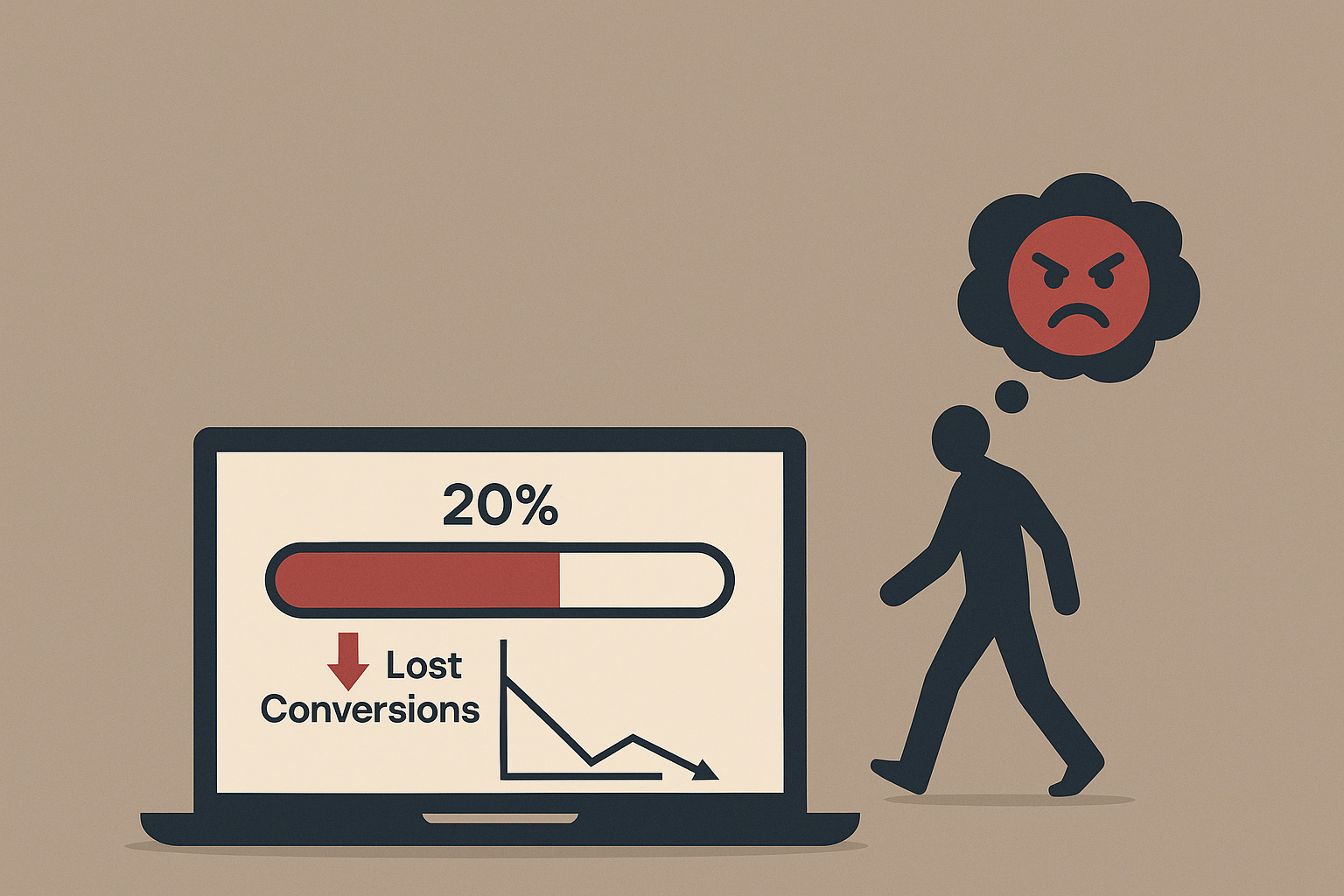
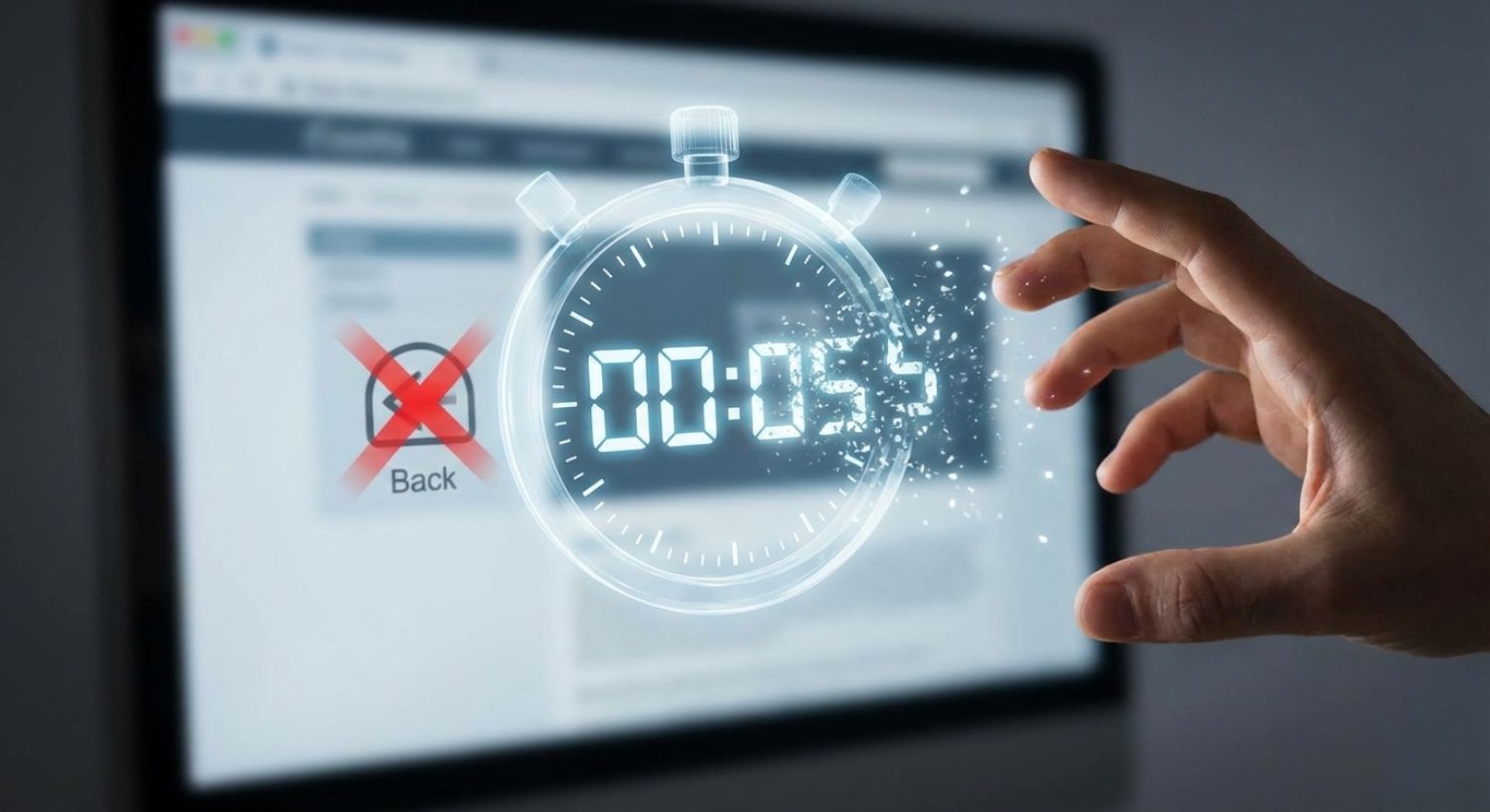
Your visitor will give you five seconds.
That is it. That is the entire window of opportunity you have to make a sale. It is the time it takes to tie a shoelace or watch a traffic light turn from yellow to red.
In that fleeting sliver of time, a silent battle is fought in your visitor’s brain. If you win, they scroll. If you lose, they bounce.
If you are struggling with a high website bounce rate, the problem isn’t usually your price or your product. The problem is Clarity. You are failing the website first impression test.
Your Visitor’s Brain Is Running a Triage
To understand why visitors leave so quickly, you have to stop thinking like a business owner and start thinking like a triage nurse in an emergency room.
When a visitor lands on your site, their brain is in a state of high alert. They are distracted, skeptical, and overwhelmed by options. They don’t have time for a full medical history. They need to make a snap judgment: “Is this relevant, or is this a waste of time?”
In the first five seconds, their subconscious mind is screaming three specific questions:
- Where am I? (What is this site about?)
- What can I do here? (What do they sell or offer?)
- Why should I stay? (What’s in it for me?)
This isn’t a thoughtful analysis. It’s a hunt.
Eye-tracking studies have proven the “Twenty Percent Truth”: On a typical web page, users read at most 20% to 28% of the words.
They don’t read; they scan. They forage for keywords and cues. If your website forces them to hunt for the answers to those three questions, they won’t work harder to find them. They will simply hit the back button.
This is the Law of Least Effort in action.
The Anatomy of a Perfect First Impression
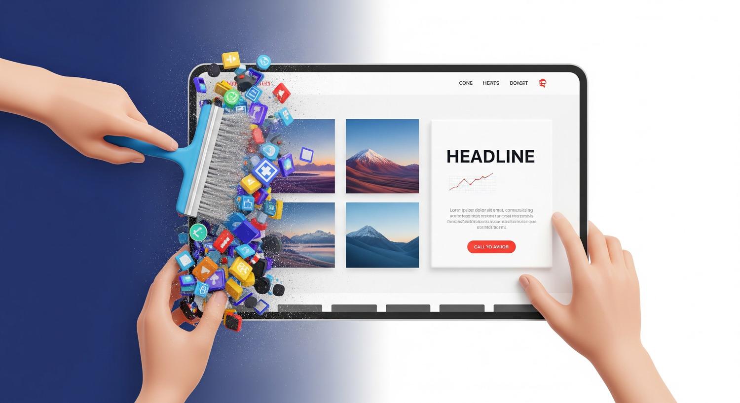
So, how do you pass the triage test? You don’t do it with a “Welcome to our website” banner. You do it by engineering the “Hero Section”—the top part of your site visible without scrolling.
A high-converting Hero Section isn’t just pretty; it’s a communication machine built on a “Power Trio” of elements working in harmony: The Headline, The Sub-headline, and The Hero Image.
1. Your Headline (The Hook)
Your headline is not a title. It is an advertisement for the rest of the page.
Most businesses fail here because they try to be clever or corporate. They use phrases like “Integrated Solutions for Tomorrow” or “Quality You Can Trust.”
These are empty words. They contain zero information.
A headline that converts follows a simple formula: Outcome + Qualifier.
- Weak: “Quality Landscaping Services” (Vague. Who cares?)
- Strong: “Get a Barbecue-Ready Lawn in Under 14 Days” (Outcome: Ready for the party. Qualifier: 14 days.)
The first describes a business. The second solves a problem.
2. The Sub-headline (The Promise)
If the headline catches their attention, the sub-headline explains how you deliver. It answers “What can I do here?” by offering specific benefits or social proof.
- Headline: “Accounting Software Built for People Who Hate Accounting.”
- Sub-headline: “Finally, get your invoices paid 2x faster without the headache. Trusted by 50,000 small business owners.”
3. The Hero Image (The Connection)
Your image must answer “Who is this for?” If you use a generic stock photo of people shaking hands, you are signaling “we are a generic company.”
A great hero image shows the customer in their “After State”—enjoying the result of your product. It creates an instant, emotional connection that text alone cannot achieve.
How to Diagnose Your Clarity Problem (The 5-Second Test)
You might think your website is clear. You are wrong.
You suffer from the “curse of knowledge.” You know your business so well that you can no longer see it with fresh eyes. You fill in the gaps in your messaging with information that exists only in your head.
To find out if you actually have website clarity, you need to run The 5-Second Test.
It is simple, brutal, and free.
- Find a test subject who has never seen your website (a friend, a stranger at a coffee shop).
- Open your site on a screen.
- Let them look at it for exactly five seconds.
- Close the laptop or turn off the screen.
Now, ask them those three vital questions:
- “What does this company do?”
- “What can you do on the site?”
- “Who is this for?”
If they say, “I think they sell some kind of software?” or “It was just a picture of a building,” you have failed. Your cognitive load is too high.
If they say, “It’s a landscaper who fixes messy lawns fast,” you have won.
This is the “quick” version. The complete testing protocol, including the specific question frameworks to uncover hidden confusion and the method for analyzing the results, is detailed in Chapter 2 of Decoding The Click.
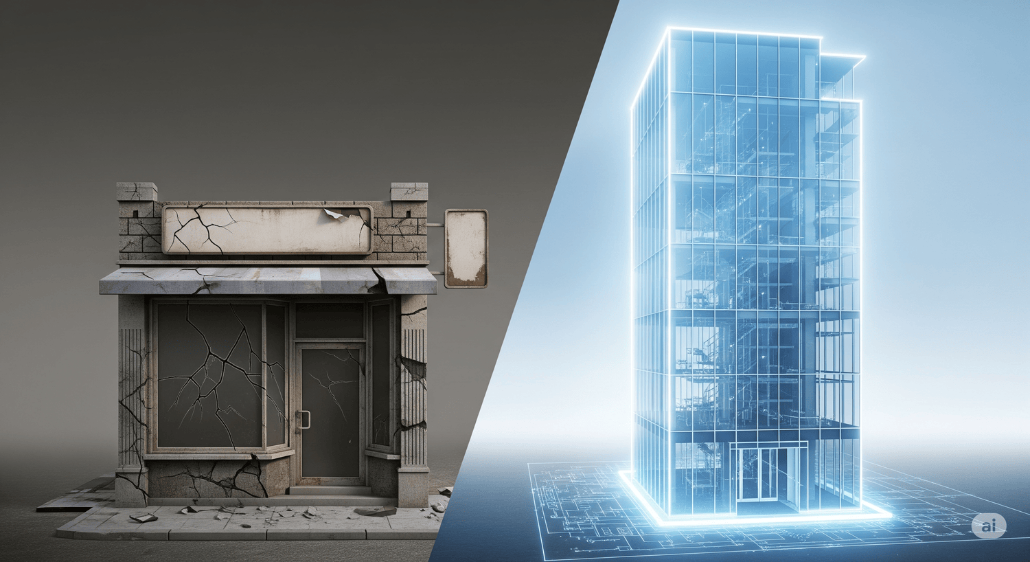
The Tale of Two Startups
Why does this matter so much? Let’s look at two hypothetical companies: ClutterBox and Streamline.
ClutterBox has a “creative” website. The menu is hidden behind a mystery icon. The headline is a paragraph of jargon about “paradigm-shifting collaboration.” An autoplay video starts blaring music.
Sarah, a busy manager, lands on ClutterBox. Her brain instantly spikes with cortisol. It’s too much work. She feels a wave of low-grade stress. She clicks “Back.”
Then she lands on Streamline.
The headline says: “Stop Drowning in Tasks.” The bullets say: “See all your work in one place.” The button says: “Start Free Trial.”
Sarah’s brain relaxes. She doesn’t have to think. The path is frictionless. She clicks.
This is the “Slippery Slide.” Your goal is to grease the chute so effectively that the visitor glides from the headline to the call-to-action without ever pausing to think.
Clarity Is The Gatekeeper
You can have the best product in the world. You can have the most persuasive testimonials and the most exciting offer.
But if your visitor cannot understand what you do in five seconds, none of that matters. They will never see your testimonials. They will never read your offer.
Clarity is the gatekeeper. If you don’t pass the 5-Second Rule, the door to the sale stays locked.
Your Next Step: Once your message is clear, your visitor is ready to move. But where do they go? If the next step isn’t effortless, they will still leave. Read the next article to learn how to design a frictionless path: Your Website Visitors Are Lazy, Impatient, and Skeptical—Here’s Why That Matters
Mastering the first impression is just step one of the C.O.N.V.E.R.T. Method. For the complete library of “Power Trio” headline formulas and the advanced 5-Second Testing protocols used by pros, get your copy of Decoding The Click.