Imagine walking into a large, unfamiliar store with no signs, no logical aisles, and no helpful staff. You’d wander aimlessly, get frustrated, and quickly leave. This is precisely what happens every day on websites with poor navigation.
Your website’s navigation is its roadmap. If that map is confusing, cluttered, or broken, you’re not just creating a minor inconvenience; you’re actively driving away customers, damaging your brand’s credibility, and sabotaging your SEO efforts. Well-designed navigation is one of the most critical elements for user experience (UX) and can make or break your chances of conversion.
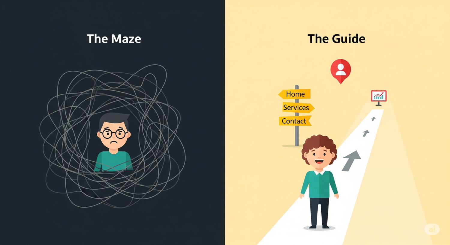
As a website strategist who transforms digital properties into profit centers, I see businesses make the same critical navigation mistakes time and again. Let’s explore why your website might be a “digital maze” and walk through the clear, actionable steps to turn it into a superhighway for your customers.
The Frustration Factor: What Bad Navigation Looks Like
Poor navigation is a central component of a bad user experience, leading to immediate frustration and high abandonment rates. Even well-designed sites can lose up to 55% of visitors due to poor navigation alone.
Here are the most common mistakes that turn your site into a maze:
- Overloaded Menus: Cramming too many options into your main navigation overwhelms users. Psychology tells us that short-term memory can only hold about seven items. When you have too many menu options, the important ones become less prominent. A good rule is to limit your main menu to 5-7 items.
- Unclear or “Creative” Labels: Using vague labels like “Products,” “Services,” or “What We Do” does nothing to communicate value or help SEO. Worse yet is using internal jargon that users won’t understand. Your navigation labels should be descriptive and use language your audience understands.
- Inconsistent Placement: Your navigation should be a reliable anchor. If it moves or changes from page to page, it creates a disorienting experience that erodes trust and familiarity.
- Lack of a Search Bar: For any site with a significant amount of content, a search function is essential. It’s the safety net that allows users to find exactly what they need quickly when your menu doesn’t suffice.
The Unseen Penalty: How Poor Navigation Crushes Your SEO
Bad navigation doesn’t just frustrate users; it makes your site nearly invisible to Google. Search engine crawlers follow links to discover and index the pages on your site. A confusing or broken navigation structure creates roadblocks for these crawlers.
- It Prevents Indexing: If search engines can’t find your important service or product pages because they’re buried under multiple clicks or have broken links, those pages simply won’t rank in search results.
- It Harms User Experience Signals: Google’s John Mueller has confirmed that they see the homepage as the most important part of a website for crawling and understanding site structure. Pages that take many clicks to reach from the homepage are considered less important. Furthermore, high bounce rates and low time-on-site—direct results of poor navigation—signal to Google that your site isn’t valuable, which can lower your rankings across the board.
The Fix: A Blueprint for Clear, High-Converting Navigation
Creating intuitive navigation is about making your website’s structure logical and predictable. Here is your actionable checklist for success.
- Plan Your Site Structure First: Before designing anything, map out your information architecture. Create a sitemap that organizes your content into clear, logical categories and subcategories. This is the blueprint for your entire navigation system.
- Simplify and Prioritize Your Main Menu: Limit your top-level navigation to no more than seven items. Place the most important links at the beginning and the end of the menu, as this is where user attention is highest (a psychological principle known as the “serial position effect”). “Contact” should almost always be the last item.
- Use Clear and Descriptive Labels: Ditch generic terms. Instead of “Services,” use descriptive labels like “Web Design” or “Digital Marketing.” This is better for both users and SEO.
- Ensure Consistent Placement: Your main navigation menu should be in the same place on every single page of your website, typically horizontally at the top. Consistency builds familiarity and makes users feel confident while Browse.
- Implement Breadcrumbs: For sites with multiple layers, breadcrumbs (e.g., Home > Services > Web Design) are invaluable. They show users their location within the site’s hierarchy and provide an easy, one-click path back to previous pages.
- Make it Mobile-Friendly: With over half of all web traffic coming from mobile devices, responsive navigation is non-negotiable. Use a mobile-friendly “hamburger” menu and ensure all links and buttons are large enough to be easily tapped on a touchscreen.
- Don’t Forget the Footer: The footer is the perfect place for important but secondary links, such as “Careers,” “Privacy Policy,” or your social media icons. Users who scroll to the bottom of a page are often looking for this information.
By transforming your website’s navigation from a confusing maze into a clear and intuitive roadmap, you do more than just improve user experience. You build trust, boost your SEO visibility, and create a powerful system for guiding every visitor toward becoming a loyal customer.